When I first moved to VT I used to bike to class from my dorms, and I quickly discovered that VT campus was not built for efficient traversal by wheels.
There were options, but many of the paths were extremely steep and it felt like I was taking a massive detour everywhere I went to not get funneled into a path where the only option down was a stairwell. When compared to the many more efficient ways I could get around by foot, I quickly stopped biking.
Having that choice, however, is a luxury.
I began to think about what it was like for students who not only relied on wheels, but walkers, crutches, or other devices that found using stairs impossible or at least difficult. It dawned on me then that beyond even just the pathways being convoluted to navigate, most building entrances also had stairs!!
It made me wonder how often did someone try to get to a building only to find it had stairs and they had to go on another detour? Was there documentation on the accessible entrances on campus? How did people relying on their being accessible entrances plan their routes from class to class? Is there a way to make this an easy process for students or people coming to Virginia Tech so that they have an easier time navigating campus?
To answer the existing documentation question: Virginia Tech does offer documentation on accessible entrances and paths in the form of the Accessibility Map below.
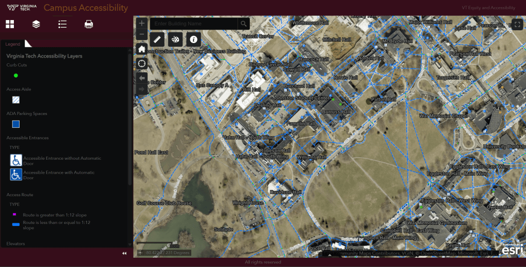
This map is interactive to the extent that you are able to get the information that you can look up a given building and be able to see it’s accessible entrances the routes leading to them. However, you can’t route on the map.
This lead me to thinking: what if you could have an accessibility map with routing capabilities?
This is what got me to the idea of AccessiNav, an accessible navigation app that would allow people to estimate the efficiency of routes between their classes and activities on VT campus.
The work I have done so far on the project is a task analysis, storyboard/low fidelity wireframe, and user interviews with a low fidelity prototype to gain insights on what features should be added. I worked on this as a group project for my Introduction to Human Factors Engineering course, but all the work that is shown on this page is mine.

Here is a task analysis of the task of putting in a route into the software.

Here is a storyboard that mapped out the basic features of the application, while going through the task of putting in a route.
This sequence was put together in Figma by one of my team mates on the project, which I am still trying to get access back to or I may just end up remaking for the sake of practice.
When this is done it will be added to this section.
This prototype was the one used for user testing. Where we had potential users, ranging from students to with specific mobility needs to older family members of students that need help navigating around the area during visitations.
The tests were done using NASA TLX scoring method, with follow up questions about what they thought about the features included and if there was anything that they thought could be added.
One of the major insights that was gained from these interviews is that for one individual who had a mobility disorder that made them frequently tired, that adding a way to route for paths with specific grades and to be able to map rest (sitting) stops on a route would be really helpful.
These were taken into account in the second iteration of the digital prototype, which was the final iteration for the class.
This is where the project is at present, it is one that I have tried to pitch to some groups on campus in the past and would love to see actually come to fruition at some point.
I feel that this might have more luck as a tool being an add on to the person’s map tool of choice so that they are able to consolidate information between their different mapping tools. However, I do not know what the feasibility of this would be.
We shall see where this project goes in the future!
